


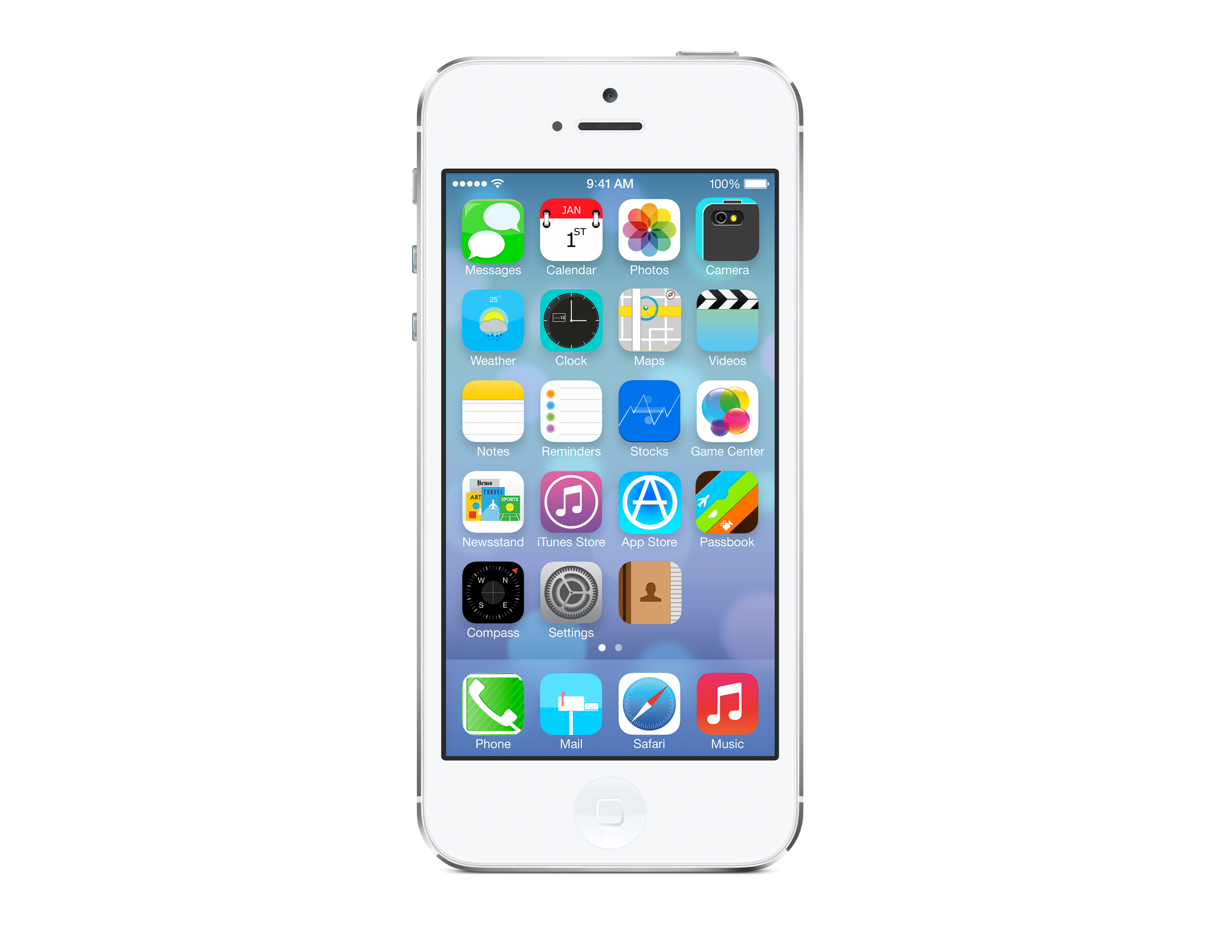
 Today we completed the icons required for our classes brief, we did not make enough to cover the iPhone menu, so I put in some current iOS icons.
Overall I am quite happy with how they turned out, I would have to say the icons we made in Photoshop are the ones I am alot happier with. If there was anything I would change it would be the earlier icons I made using Illustrator (eg. Calls and maps), as I learnt alot more the further I worked through the icons. I would like to see the same techniques I learnt applied to these.
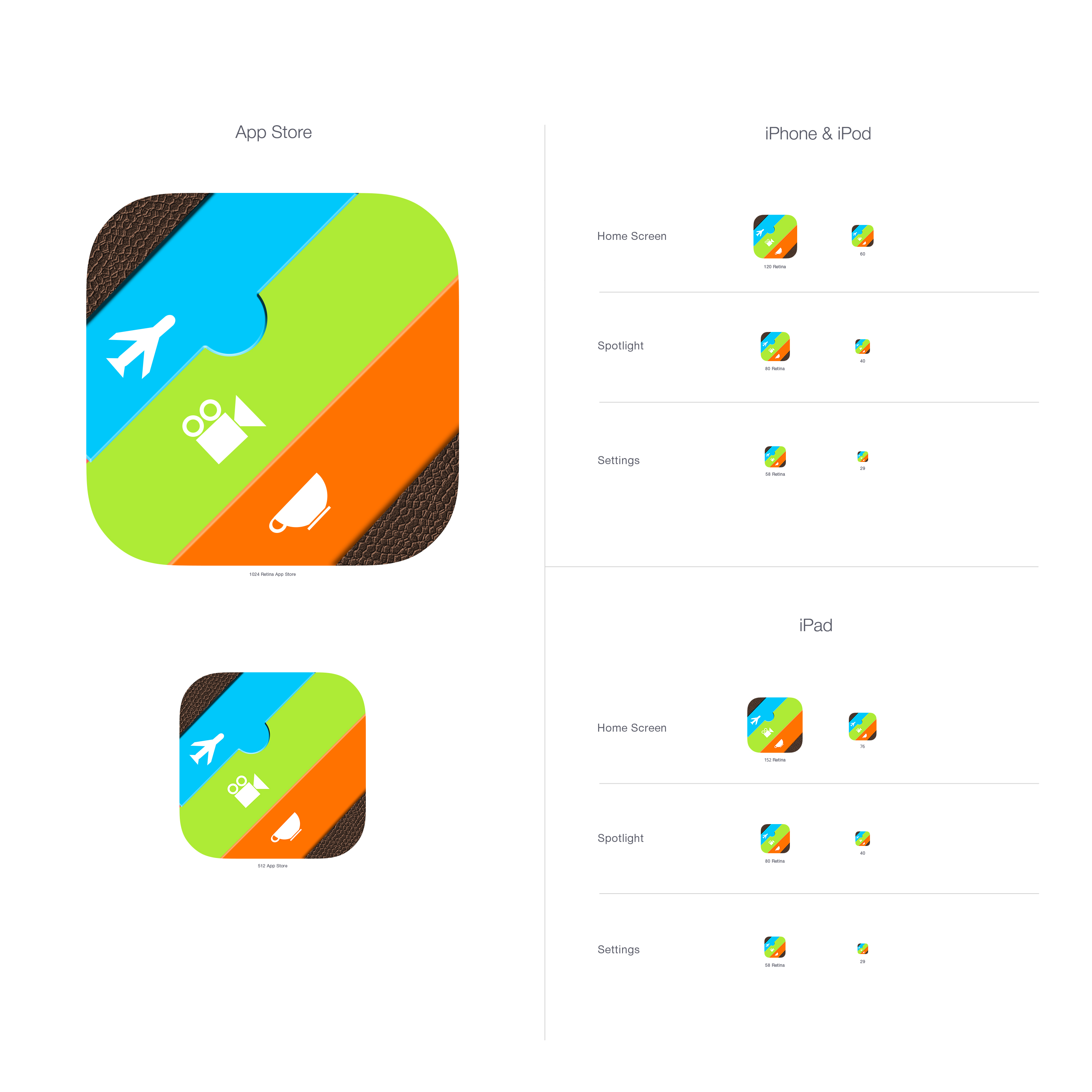
Images used for references:
Roughs:
again I am using, the same style theme as the current iOS but changing the buttons to how I believe they should look. the phone icon I wanted to alter but not too much, I added a phone chord around the phone to box it in, keeping the striped background style.

Calls roughs
Final:
Here is the final design for the calls icon, I applied a striped background using the blend tool and allocating how many steps it needed to cover the box. I made the phone from various shapes and then merge them together as one piece. I applied a soft drop shadow to the phone, also applying a gradient to the bottom left corner.

** Updated Tues 24th Aug**
Here is the final design with the grid system applied to the icon. The phone chord gives creates more of a wall around the phone, going close to the edges.


