Doug Keating
21 Year-old Student studying Graphic Design.
Tag Archives: critique
Fortnightly Critique – Gig Poster
Koffin Kats
Source: http://gigposters.com/poster/164225_Koffin_Kats.html
Designer: Snack Machine Creative
Immediately this design caught my eye as I was scrolling through posters. This gig poster, promoting the a gig for the Koffin Kats. The use of both positive and negative whitespace helps to establish a busy, but easy to read event information. The main shape of the poster being a coffin, helping to enforce the band name along with the bones arranged to spell the main act. The handmade look is the main theme for this poster, most probably sections were done by hand, later worked with on the computer later. The more you look at this poster, the more you notice little pieces. The visual heirachy in this image is focused with downward directional forces. I find this poster is easy to read and understand, even if there is alot going on around the information, the green highlights around the text help to create this.
Conclusion
Overall I really like this poster, the overall colour scheme (black base, white font, green highlights) is quite nice, also giving off a horror/haunted vibe (similar to “The Misfits” punk band). The art style is great, and has been used to fill the areas around the text quite close. If there was anything I would change about this poster, it would be to maybe include not only the date for the gig, but the time for when doors open.
Fortnightly critique – Website
Source: http://www.romainbriaux.fr/
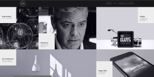
This website features the work of Romain Briaux, a french student in his 4th year at HTEC, specializing in web design. The site work as an online portfolio. The layout of the site is very easy to navigate through, the organisation of the information is interesting and quirky.
The landing page (above) for the website is simple, but shows a video loop playing in the background. The site immediately focuses on its main use with very little text on this page but in bold “WELCOME TO MY NEW PORTFOLIO” is seen so the audience gets an immediate idea of what the site is all about.
Viewing the designers work is very interesting in regards to layout and organisation (see image below). The site uses animated tiles once the mouse hovers over it, perhaps using “onmouseover” in their code. Once one of the tiles is clicked the interface then slides over to the topic selected.
The buttons are well labelled and located, these are for information such as about, my work, contact, and various social media links.
Conclusion:
Overall I like the sites theme, layout and functions. It has most of the characteristics for a well designed website, my issue though is in regards to load times. The target audience for this site would be those interested in web design, potential business and for the own designers use as a portfolio. In saying this the target audience’s internet connections must be relatively fast, and good in connection, this was the designers focus. For a wider audience though, this would not work so well as the site has so many functions applied to the main navigation that it may create a difference experience for another user (eg. slow speeds, site timing out).
Fortnightly critique (no.2) – AMOR Wine
Source: http://www.packagingoftheworld.com/2013/07/amor.html
Packaging – AMOR Organic Wine
Designer – Giovanni D’Andrea, France.
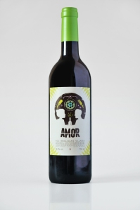
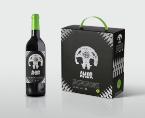
AMOR organic wine was designed in Beaujolais, France. The wines theme is Mexican, “Amor” translating to “Love”, the strong colour scheme and Sugar Skull enforce this theme too. The main focus on the labels design is from a distance a Mexican Sugar Skull, but up close is a couple enjoying a bottle of wine, using the negative space to create this, the bottles name “Amor” creating the teeth below this.
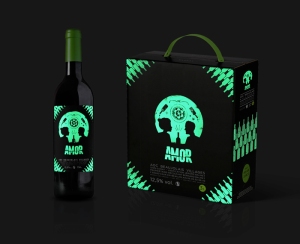
The Mexican theme is consistent with the boxes packaging as the wine bottle pattern repeating on the edges using negative space to establish a pattern. The idea of making the design have a glow-in-the-dark feature is creative and original too, once again fitting to the overall theme of the design.
Conclusion
Overall Amor Wines has a very orginal and creative label with packaging. Its simple and establishes its Mexican theme perfectly, if there was anything I would change about this it may be to add a few more patters around the sugar skull, this would highlight the main focus more and would fill up some of the whitespace surround the skull.
Fortnightly critique – Beanies
Packaging – Beanies Coffee
Designer – Robot Food Packaging
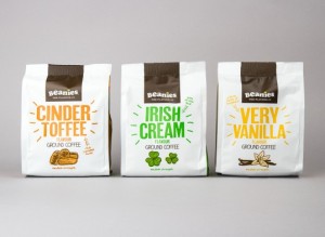
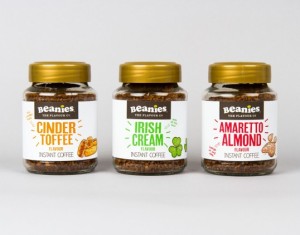
Beanies coffee was designed in the UK by Robot Food packaging. The packaging layout is consistent amongst their coffee range, the hand drawn style of the coffee flavours give the product a more personal feel, the color enforcing the packages flavour. This also can be seen with their use of font, which is quite quirky and again, enforces that personal feel. The layout of the package is well thought out, the ground and instant coffee having little notes on them, for example the Irish Cream has a note on it saying “With all the luck”. The consistency of these products in regards to layout and design style does not differ.
What I did not like
If there was something I would change, it would be the Cinder flavour and the Vanilla Flavours packaging colour, as they look quite similar.
Conclusion
Overall Beanies coffee packaging looks great, it is eye catching and consistent amongst their products in regards to theme and style. The product stands out amongst others on the market, giving the own packaging its own style and theme, compared to the standard of packing for regular coffee.
