Reference Images
Roughs
Final
Source: http://www.packagingoftheworld.com/2013/07/amor.html
Packaging – AMOR Organic Wine
Designer – Giovanni D’Andrea, France.
AMOR organic wine was designed in Beaujolais, France. The wines theme is Mexican, “Amor” translating to “Love”, the strong colour scheme and Sugar Skull enforce this theme too. The main focus on the labels design is from a distance a Mexican Sugar Skull, but up close is a couple enjoying a bottle of wine, using the negative space to create this, the bottles name “Amor” creating the teeth below this.
The Mexican theme is consistent with the boxes packaging as the wine bottle pattern repeating on the edges using negative space to establish a pattern. The idea of making the design have a glow-in-the-dark feature is creative and original too, once again fitting to the overall theme of the design.
Conclusion
Overall Amor Wines has a very orginal and creative label with packaging. Its simple and establishes its Mexican theme perfectly, if there was anything I would change about this it may be to add a few more patters around the sugar skull, this would highlight the main focus more and would fill up some of the whitespace surround the skull.
Packaging – Beanies Coffee
Designer – Robot Food Packaging
Beanies coffee was designed in the UK by Robot Food packaging. The packaging layout is consistent amongst their coffee range, the hand drawn style of the coffee flavours give the product a more personal feel, the color enforcing the packages flavour. This also can be seen with their use of font, which is quite quirky and again, enforces that personal feel. The layout of the package is well thought out, the ground and instant coffee having little notes on them, for example the Irish Cream has a note on it saying “With all the luck”. The consistency of these products in regards to layout and design style does not differ.
What I did not like
If there was something I would change, it would be the Cinder flavour and the Vanilla Flavours packaging colour, as they look quite similar.
Conclusion
Overall Beanies coffee packaging looks great, it is eye catching and consistent amongst their products in regards to theme and style. The product stands out amongst others on the market, giving the own packaging its own style and theme, compared to the standard of packing for regular coffee.
Website (i) – http://www.eyesuckink.com/
www.eyesuckink.com/ is a website owned by Alex Pardee. The site features collections of his works, information about the artist, an online store, and a blog. The target audience for this site would be those who are fans of his work as the site is promoting his works and allowing those interested to keep up to date with his blog. Alex Pardee has covered many different mediums through his development as an artist, I feel this is why he kept the home page fairly plain. The image gallery though, has a lack of information, the art series should contain some information of the works but instead it has a large white space to the left of the image. An example of this can be found here. The websites navigation is quite simple, but this works for ease of acces.
Website (ii) – http://www.thebutchershop.com.au/
The Butcher Shop is primarily an Australian street art/ art supplies store. The site not only sells art supplies and clothing, but also helps artists keep up to date on workshops that are held locally, legal areas to paint, helpful resources such as how to get started freelancing , locations for teachers to take students on excursions. The target audience for this site would be anyone who is interested in art. The websites navigation is simple and well organised, the main navigation bar also including social media links such as “Instagram” and “Facebook” which is updated regularly.
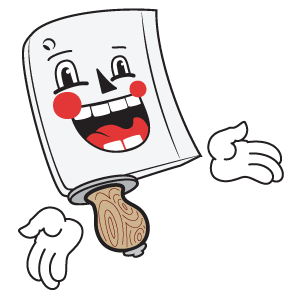
The site has a “retro butcher” theme to it, in the past I have ordered from here and recieved my items wrapped up in butchers paper and tied with string, with a large red stamp with their address on it. Their mascot also enforces this theme.
